I was throwing together fabric combinations for an ad. I wanted to show the great fabrics that we will have for the Fabric Fashion Show in March. This is a really fun event. It is a sold out event every year. What we do is we put groupings of fabric together. I usually choose the customers that really wow me when they come in to the shop. They are the ones that can pick out combinations that I never would have thought possible. They just have a very unique perspective and it always works beautifully. They are my experts. They put together combinations and we cut them into half yards. Then, the customers at the show can purchase these combinations.
It’s also very educational. We discuss why certain combinations work, and what to avoid when you are putting things together.
We have refreshments, and share a lot of good company.
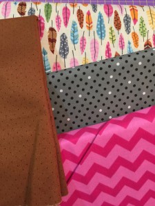
Last night I was creating some combinations. I kept looking at this combination and thinking that the colors were right, but it just didn’t look good.
See what you think. I know why it didn’t work. See if you can tell. The colors are right, they all go together with the feather print, but it just doesn’t work.
With the exception of the brown, they are all to similar in intensity. This is a common mistake that people make. Even if the colors are right, it won’t look good if there isn’t enough variation on the gray scale. I will often take my camera and turn it to black and white so that I can see if I am right. Everyone has a cell phone. Try it yourself. Turn you camera to black and white when you’re in a quilt shop.
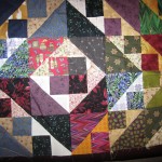
Have you ever seen a quilt that looks great but he colors are not ones that you would think might go together? It probably works because of intensity. Yes, that’s exactly right. Color is less of a factor than intensity is. Now look at this combination. Much better right?
Come to the Fabric Fashion Show in March. It is March 6th at 2:00 p.m. You will be wowed!


