Color wheels are beautiful. Everyone loves to look at them but few people know how to utilize them. They are useful as a roadmap when deciding on which colors to pick for a quilt. However, it may not be easy.
Color is the one thing that my customers say is the hardest thing for them to deal with when making a quilt. People understand how to use a scant quarter inch, and they understand matching points. However, choosing a color scheme can be paralyzing.
We’ve all made quilts for others that we don’t enjoy making. Usually, it’s because we don’t like the colors that they have chosen. Well, let’s keep these episodes to a minimum shall we?
Life is short. Work with the colors that you love!
My favorite color wheel is by Joan Wolfrom for C&T Publishing. She’s a genius. So, if you don’t have one in your repertoire, get one soon.
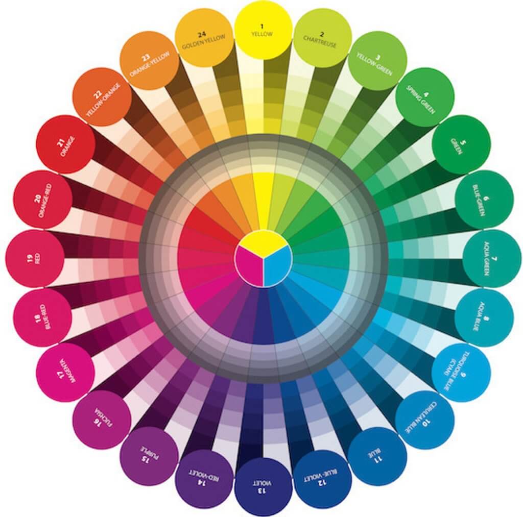
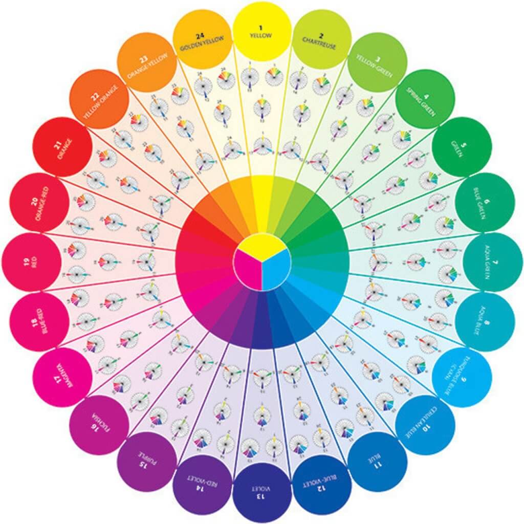
The top image is the front of the color wheel, the bottom one is the back. On the back will be a synopsis of what I am going to describe in the following paragraphs.
If you find yourself paralyzed by choosing color, I have the perfect plan to help you. And trust me, this will help you immensely.
Always, always start with the fabric that makes your heart sing. Like I said above, life is short. Eat dessert first and always choose fabric that you love.
So, let’s say the predominant color of your favorite fabric is orange. I love orange. So choose your fabric. Then, use this thought organization tree. This is copyrighted information from C&T Publishing from one of my books, so if you plan to use this in any way you must get permission or feel the wrath of a publishing company in your mailbox.

Take your colorwheel out and find the color you want. Look at the orange bubble. Under the orange bubble there is a cone of color. One side of the cone is tints and the other side of the cone is shades. A tint is a color with white added to it in various amounts, and a shade is a color with black added to it in various amounts. Compare the fabric with the large bubble and the colors below it to make sure that you’re getting that color. Lay the color wheel right onto the fabric.

Every single color has this cone beneath it.
So let’s discuss the gray bars under the colors. Grays can be tricky. A true gray is simply black with white added to it, or white with black added to it. If you add more black, it gets darker gray and more white, it gets lighter gray. It’s hard to find fabric that is just plain gray which is simply black + white. Tip: Studio e Snippets Pearlescent gray is perfect.
The gray rings below the colors are what happens when you add that particular color to gray. Some fabric companies have grays that tend to always lean toward a particular color. Example: Michael Miller has a lot of gray that leans blue, and Moda has a lot of grays that lean brown.
So let’s use the decision tree above to help with putting together a quilt. If you want to keep it really simple, and beautiful, do a monochromatic quilt. Remember, A MONOCHROMATIC QUILT USES THE COLOR BUBBLE AND CAN USE ALL OF THE SHADES AND TINTS BELOW IT. It isn’t boring, not in the least.
Let me show you how many options there are with one color.

If you look at where the tiny arrow at the top is pointing, it’s pointing out a color, just like the bubble on the color wheel. Moving from left to right on the box, you have saturation. Saturation is simply how much of a color is added to a piece of fabric. It’s not a shade or a tint. If you’ve ever seen a dip dyed shirt, you would understand what I mean. There’s less color added to the shirt at the top of the shirt, and as the bottom of the shirt hangs in the dye for longer, more color is absorbed by the shirt.
Here’s a picture from a J. Crew ad.

There is more dye added to the bottom of the shirt as it stays in the dye longer resulting in greater saturation at the bottom. So, it’s the same exact color just with varying amounts of saturation.
If you move from top to bottom, you move toward adding black to the fabric which results in a shade. In the top left corner is the tint. Every single one of those dots under the square is actually the same color but they vary in saturation, tint and shade. But, they are all the same color. Now you can see that a monochromatic quilt is anything but boring. Here’s another example:

Remember this is all one color. Look at where the little arrow is pointing. That is one color, and inside the box are all the variations of it.
If you would use this color and then move the arrow and add another color very close to it, you would have an adjacent color quilt.

So here is an example of adjacent colors. This is incredibly beautiful because it ALWAYS WORKS. Not only do you have the bubbles on the top, but all of the shades and tints beneath it to use in your quilt. This lends a very blendy look to a quilt which is gorgeous.

These are all adjacent colors. Notice how the pointer on the left side has been moved upward, and the color has changed. Then I pulled paint swatches out from the colors that are shades, tints and saturation differences. Imagine using all of these samples of color into one quilt. It would be beautiful, and would have a very relaxing “seafaring” feel. And, this would be an adjacent color scheme. Here’s where it would be on the color wheel:

Those 2 color schemes are my favorite. No, not colors but color scheme. The Monochromatic and Adjacent color schemes.
Here is a great example of a monochromatic piece of fabric.
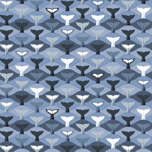
You can see how there is blue, and the difference in saturation, shade, and tint. There’s also white that leans blue, so it’s a less saturated blue that is almost white. You can see where it lands on the side bar, and the shades, tints and saturations are chosen from within that color.

!
And I dare say, it’s anything but boring. Right? Okay, now let’s talk about Complementary color schemes. They’re much more difficult to do since you are now dealing with saturation, tint, shade and now opposites! They’re opposites on the color wheel, and you’re going to have to decide where to place the pieces to look pleasing when they’re strikingly different. My suggestion? Lots of eye rest. By this I mean that you should keep space in between the contrasting colors that is neutral to allow your eye to rest. Or, space around the assets to make sure that there is ample rest for the eyes. Here’s an example of a complementary scheme in a quilt.
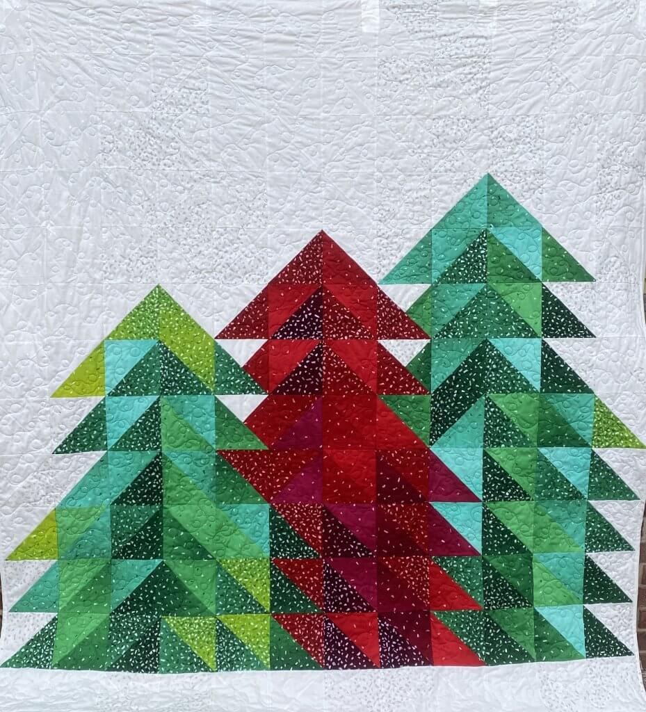
Notice that there’s a lot of space in which to rest your eye.
When I am referring to Split Complementary I mean that the colors are opposites on the color wheel, but that they can be adjacent colors with a complementary, or triadic, or two spans of adjacent that are opposites. They are much more complicated, and since this is meant to be a primer in beginning color selection, I am not going to delve too deeply. The tree quilt above could be described as split complementary because there are adjacent colors within each tree, and they’re opposites.
Here is another example of a split complementary scheme in a quilt.
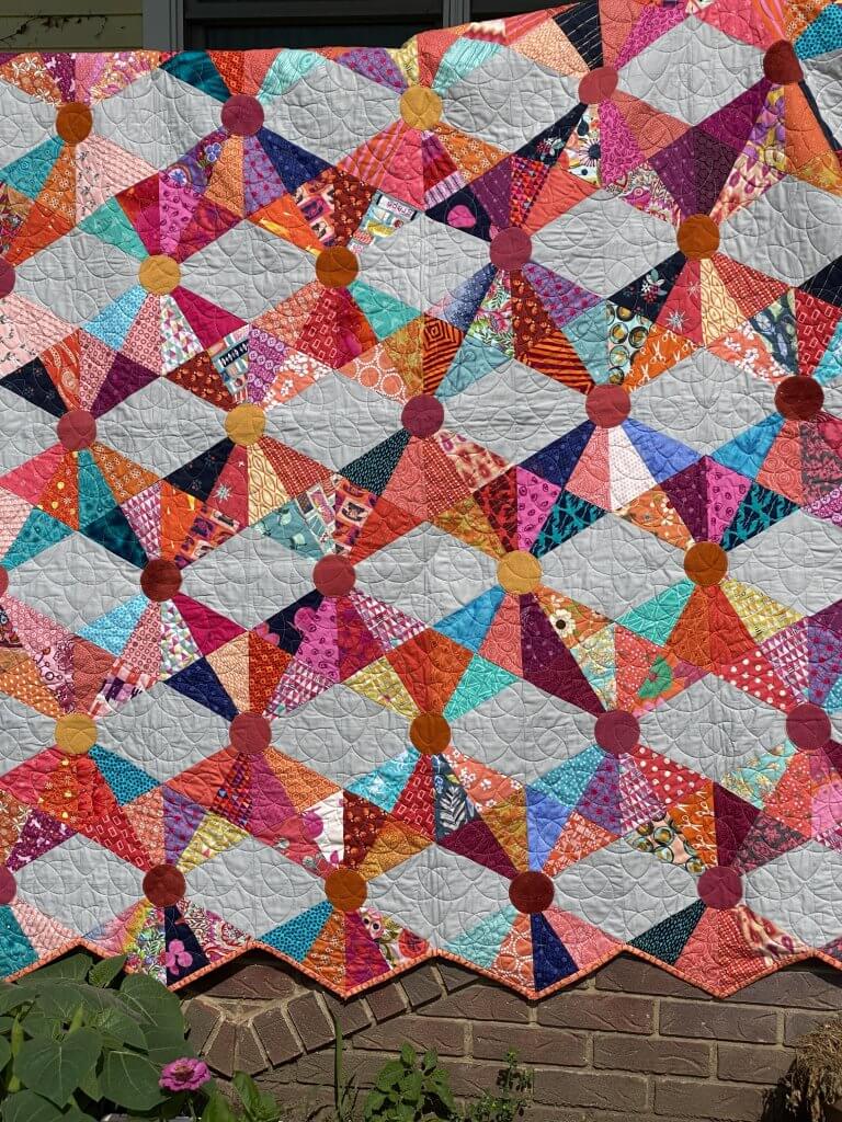
Notice the use of the gray as eye rest. The gray is also a very true gray. Here’s where this lies on the color wheel.

Don’t forget, it’s not just the outside bubbles that are used in the quilt, it’s the shades and tints in the cones beneath.
This should help with the beginning concepts of color.
