A good quilt has a good design. Wow. That’s not exactly profound. A great quilt has a good design, and then another good design. Well, that’s a little better. What I mean by that is that the best quilts have multiple components when looking long enough. Whether that is a primary and secondary design, or whether that is a design, and then a closer inspection that yields interesting fabrics. Yes, paper piecing patterns are fun, and funny and cute and clever. But works of art draw you in.
Have you ever seen a painting in a gallery that stops you dead in your tracks? Well, not all works of art will do that, and it doesn’t diminish their worth. But ponder this for a moment. A great design should pull you in, and then pull you in again. Quilts that have movement, and secondary designs do just that.
I have always said that there should be an award at a quilt show for a quilt that makes everyone stop and look at it for a really long time. Regardless of the technique, regardless of the accuracy of piecing–if there is a work that makes you look for a really long time, it should get an award. The volunteers that are floating around the floor should take notice of the quilt that everyone stops at and spends the most time at.

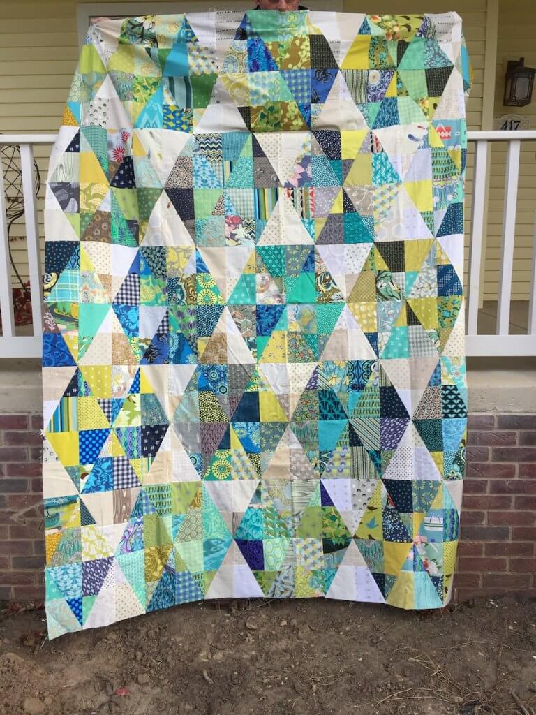
I’m not saying that this is the perfect quilt, or that it is an award winner. This is a quilt top that is going to be in my next book about scrap quilting. It has multiple designs going on within the same quilt. When you step back you see more than one design and as you move in closer you can see the vast diversity of the fabric choices. It is fun. How many designs do you see? 1. Hexagons 2. Triangles 3. Diamonds (and my husband’s nose as he hangs over the top of the quilt!!!!!)
This will increase the interest and movement in your quilt. Sometimes placement of color changes the basic shape and design of what is the most prominent.

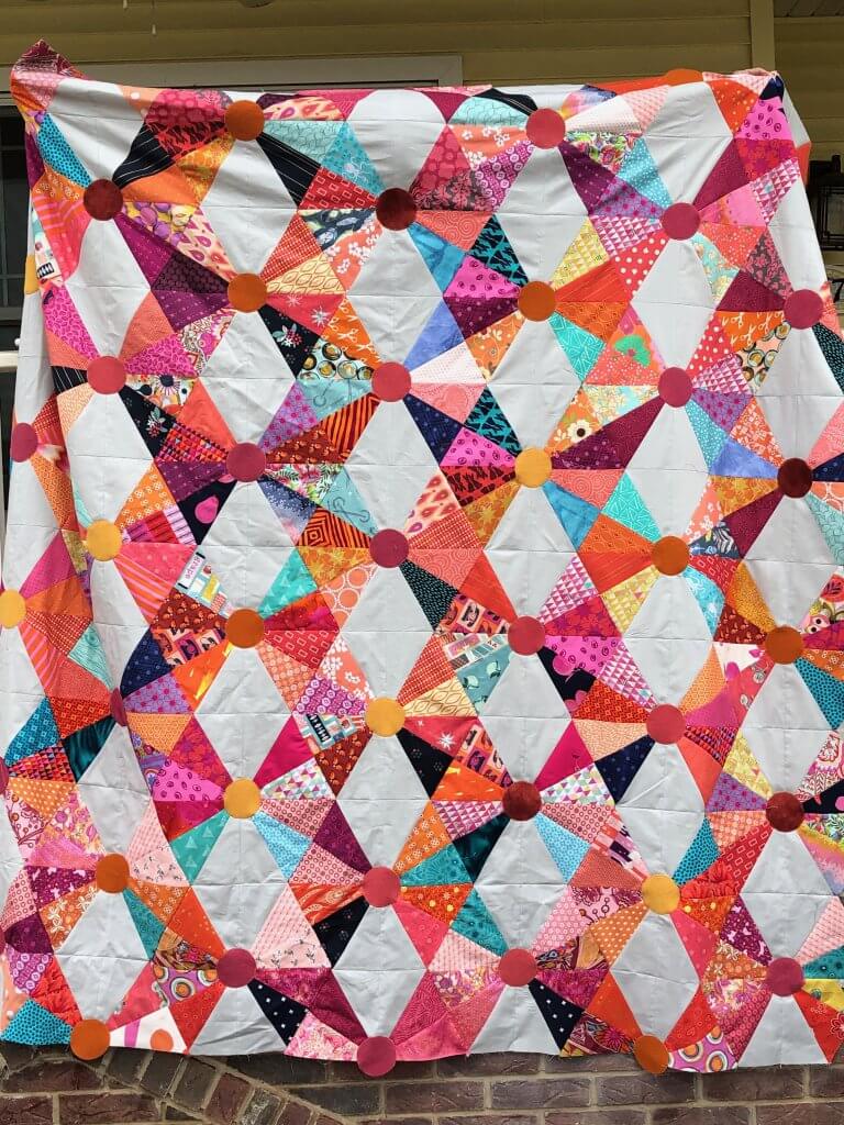
Similarly, this quilt has a lot going on. Hexagons, diamonds, tumblers, chevrons and more. Next time you want to make a quilt think about how color placement and placement of lights and darks changes your design. It’s a good challenge.

