So I was talking about sorting your colors into clear bins last time. Have you done that yet?
If you haven’t, then you better hop to it because now I am going to tell you the really fun part.
So we all know that all blues are not created equal–and that goes for reds, yellows, greens and more.
When you look at the colors in each box, there are a lot of variations within one color, aren’t there? Well, when you first started sorting them, it didn’t matter if it was a yellow or a gold, they should always land in the yellow box. The same goes for the reds. There are definitely some that are just a plain red red, but there are reds that lean way more orange, and reds that are much more blue.
So, here’s what we’re going to do, and why. We are going to split hairs a little. We are going to divide up the colors in one box and see how many variations there really are.
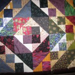
But why? Why should we do this? Well, it helps to disguise ugly prints, for one. When you divide a color into variations of a color, you can pull off using a variety of prints that will be disguised. The human eye will pick up color before it will pick up the prints.
When you separate the colors, pay no mind to the print in the fabric. Just separate it by color.
Take your blue bin and find the bluest plain old generic blue that you can find. Use your color wheel to make sure it is a medium blue–one that doesn’t lean green and one that doesn’t lean purple.
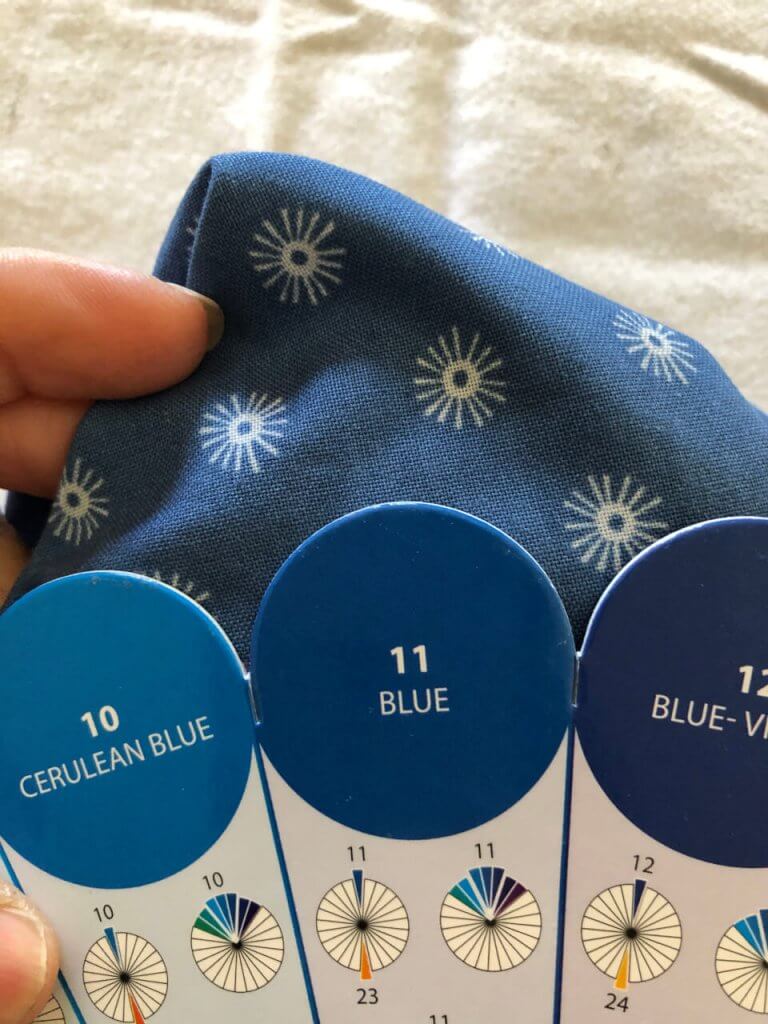
This was the bluest blue that I could find. So, I placed that in the middle. Now, a blue that leans purple is as far on the color wheel that you can go before you actually hit purple. So, I am going to find a blue that leans purple. I will put this over on the right.
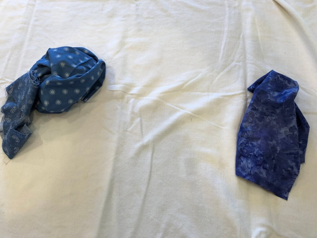
So the blue on the right is periwinkle, which is a purple-blue. I love this color. Next find the greener blues in the bucket. Find a really green blue and put it over to the left. Don’t worry, you might find a blue that is even greener, and you can put it further to the left side.
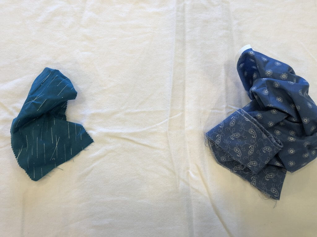
You know that there’s a difference between a green blue and a blue green? Yup, and this will help you to recognize this. What you see in the photo is a green blue. The actual color comes second in the description. The first word in the description is the adjective. It’s a “greener” blue.
Now you can start filling in. Find the next scrap in bin and find a place for it. Lay it right next to the fabrics and see where it belongs.
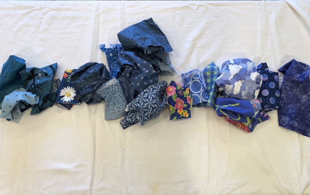
A color line is like a number line. I laid the fabric in a gradation line. All of the fabric on the right gradually leans more purple. All fo the fabric on the left gradually leans more green. Now you can start piling fabrics on top with fabrics that really look great together. Then make your block using those colors closest to each other in the pile. That is the perfect way to find fabrics that look terrific together without having to do any guess work. When you do this, you can combine multiple prints, and have it look really really great. Next we will pick a different color!
